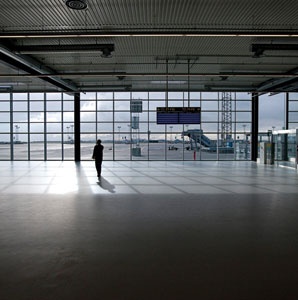
 At Copenhagen’s CPH Go terminal, efficiency is elevated to an art form.
I swear, this has never happened to me before: I emerged from an airplane, walked down the stairs to the tarmac, gazed up at a terminal, and fell in love. Note that this didn’t take place at one of those dazzling airports in Beijing or Madrid. For one thing, you don’t generally set foot on the tarmac at terminals like that. The whole business of clambering down shaky outdoor stairs instead of walking through a hermetically sealed Jetway suggests that I’m flying on the cheap, to an underdeveloped destination.
In fact, I was arriving in Copenhagen on my first trip as Travel + Leisure’s airport critic. I disembarked at the newest terminal at an airport that prides itself on functionality, and I told myself that it was now my assignment to soak up every aspect of a place that travelers generally tune out.
CPH Go is a new terminal designed, built, and priced for low-cost airlines, and the first to fly there is EasyJet. Unlike the legacy carriers, which have had to cut back in recent years, the budget airline business continues to grow, and as low-cost carriers have proliferated, bare-bones facilities have sprung up to serve them. Marseille Provence has MP2. Kuala Lumpur has Low Cost Carrier Terminal. The one at Singapore’s Changi might best represent the prevailing style. For one thing, it says budget terminal in giant purple letters mounted on the front of a yellow corrugated-metal building. Inside, the harsh, stripped-down aesthetic is interrupted by clusters of seating and the occasional potted plant.
While CPH Go is clearly a product of the budget phenomenon, it eschews the meanness that comes with the territory. No, the terminal doesn’t offer many amenities—no chair massages, no sushi, no inflatable neck pillows—and it’s small: 97,000 square feet and six gates. CPH Go is an elongated shed with a tall glass wall facing the runways. It more closely resembles an industrially inspired contemporary art space—I was reminded of New York City’s New Museum—than an airport terminal, and the visual style of the building sends a clear message: Cheap is beautiful.
CPH Go was designed by a Copenhagen firm, Vilhelm Lauritzen Architects. Kelly Nelson, a former associate partner, says his team asked themselves, “How can we subtract everything to a bare, bare minimum so you’re practically standing on the runway?” What they came up with is pretty much the antithesis of all architecturally complex airports we’ve seen in recent years: “It’s not unlike how you approached an airplane in 1939,” Nelson says. “We spooled it back to the original essence of an airport.”
Yes, it was love at first sight, but I didn’t fully understand CPH Go until my return trip. Because the budget terminal only has a coffee bar, I decided to eat next door in Terminal 3, a product of the late 1990’s, when every airport wanted to be Amsterdam Airport Schiphol. A true low-cost traveler, I bypassed the caviar bar for an aromatic green curry at YamYamToGo. As I ate, I looked around and realized that the biggest reason CPH Go looks like an art museum is that it doesn’t resemble a shopping mall. Without all the shiny kiosks vending luxury goods that crowd Terminal 3—as well as most of the world’s major airports—what you get is space: an abundance of light, square footage, and air for everyone. Those are much rarer airport commodities than anything for sale at the duty-free shop. This may be a budget terminal, but to me it’s the lap of luxury.
Opened: October 31, 2010
Designed By: Vilhelm Lauritzen Architects
Total Area in Square Feet: 97,000
Gates: 6
75% Less energy used than other CPH terminals
Budget: $37 Million
90% of passengers check in online, via mobile phone, or at a self-service kiosk.
Served by easyJet only. Other budget airlines are on the way.
Projected Passengers in 2011: 1 million
Overall: A
What could be better than a terminal that celebrates the humanity of the budget-airline traveler?
Efficiency: A+
Designed so planes turn around in 30 minutes or less. And groundwater heating and cooling lightens the carbon footprint.
Check-In: A
Largely painless. The terminal uses CPH’s highly efficient central security checkpoint. Beware of EasyJet’s strict baggage rules.
Beauty Factor: A
Surprise, surprise! Smart designers can turn low-cost materials and methods into art.
Bathrooms: A+
Generous! Functional! Scandinavian! Toilets enclosed by floor-to-ceiling walls, not flimsy stalls.
Seating: C
Granted, the whole EasyJet ethos requires endless standing in line, but they could install more seats.
Shopping: F
None. All shopping is in the adjacent terminals. Georg Jensen, the Danish Modern silversmith, is in Terminal 2.
Dining: D
Just a coffee bar. Go to Terminal 3 for casual-chic Joe & the Juice, the swanky Caviar House, and the currylicious YamYamToGo.
Transit: A+
Miraculous. Plentiful, fast trains to downtown Copenhagen (15 minutes) and Malmö, Sweden, from the train station under Terminal 3.