A new generation of terminals is setting the example for airports of the future, writes Brian Johnston.
''As pretty as an airport" isn't a simile ever likely to spring to anyone's lips, as Douglas Adams once remarked. True, there was a time when airports were part of the romance of early flying as evoked in movies such as Casablanca, but that time vanished in the 1970s, when the boom in cheap travel saw a rash of cheap, mass-market airports devoid of design, let alone glamour. Many became renowned for the grubby, dim-lit, labyrinthine awfulness that still defines our perceptions of airports.
Yet in the last 15 years, a new generation of terminals has stepped out in considerable architectural style, and is now setting the example for airports of the future. The best demonstrate that surging passenger numbers, increased security measures and lower airfares don't mean that travellers have to abandon all hope in airport purgatory as they await their flights. Some have become my favourite terminals. If I were to pick the best qualities of each, I'd have my ultimate airport to take the sting out of any flight delay.
The revolution in airport design really started in 1991 when British architects Foster & Partners planned Stansted airport near London. Like all good design, its idea was simple, though at the time revolutionary: move all unsightly services such as baggage handling and transport underground, leaving passengers with uncluttered space, high ceilings and plenty of natural light.
My first pick for this abundance of natural light would be Hong Kong airport (1998), another Foster & Partners affair, this time on a grand scale. Gone are maze-like corridors, dim lighting and low ceilings. Natural light pours into the curvaceous, streamlined terminal from vast windows. Beyond, the runway displays the marvels of take-off and landing with an optimism that recaptures some of the lost glamour of early airports such as Berlin's Tempelhof or Le Bourget in Paris.
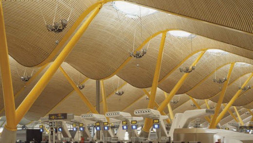
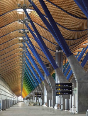
Hong Kong showed that airports could be cool: an architectural homage to modern travel, just like the soaring train stations of the Victorian era. Terminal 4 at Barajas airport in Madrid (2006) is another magnificent example. Designed by Rogers Stirk Harbour & Partners, the giant space is covered with an undulating vault in steel and bamboo that appears almost to float, supported around the perimeter by flying buttresses.
My ultimate airport would certainly have its ceilings (and its airconditioning units, which look like sculptures). Light from ceiling domes floods on to bright colours beneath and suspended walkways allow passengers fabulous lookouts over busy departure gates.
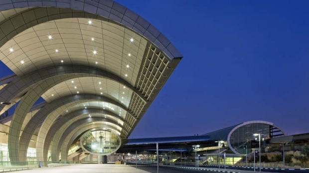
Floating - or at least seemingly weightless - roofs that provide diffused light are now a staple of new airports. The curved roof of Dubai's Terminal 3 (2008) looks like a giant wave curling towards the shore.
Terminal B at San Jose International in California (2010) is patterned with sunlight from a fabric mesh, providing suffused white light that makes me feel as if I'm on the science-fiction set of an ultra-chic Hollywood movie.
London Heathrow's Terminal 5 (2008) has rippling glass ceilings, though I might steal one of its lounges for my ultimate airport. Its pay-for-use No. 1 Traveller Lounge (2011) is rather special, with bedrooms for hire by the hour, pod-style resting cabins and a cinema showing classic British movies. Incidentally, Heathrow now has an even newer just-opened Terminal 2 (2014). I've yet to see it, but it was described by one reviewer as "more boring than soaring".
For sheer gleaming polish, Beijing's dragon-shaped Terminal 3 (2008) in steel and glass was long my absolute favourite. Soaring red columns and orange ceilings (another creation by Foster & Partners) recall the Forbidden City, yet the look is futuristic. I think it might now be edged out by Terminal 3 (2013) at Shenzhen Bao'an. It has a wonderful textural quality thanks to honeycomb-shaped windows which throw interesting patterns across the sensuously curved, all-white walls and floors. They appear to change shape as you walk, providing an almost cinematographic feel. Everything is buffed to an incredible shine: I always think arriving at the Pearly Gates would be similar to passing into the shimmering white customs area.
I'd cherry-pick Chinese terminals' polite English messages too for my ultimate airport, such as "No tossing, no climbing" and "Please do not put your body out of the escalator". My favourite is "Delayed due to some reasons" - after all, good airport design should have a sense of humour.
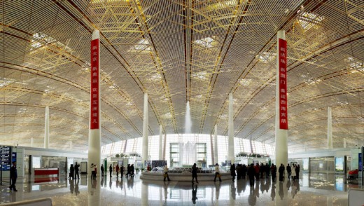
Beijing's T3 has an indoor garden modelled on the imperial gardens at the Summer Palace. A green space would have to be a must in my ultimate airport. Dubai's Terminal 3 has Zen gardens at either end, a bit overlooked among the circulating hordes, and Incheon airport near Seoul (2001) features traditional Korean gardens, a central pond and glass elevators said to resemble waterfalls. But my pick of the best would be from Terminal 3 (2008) in Singapore.
Changi airport has always been noted for its greenery, but its newest terminal has a 300-metre-wide wall of plants and waterfalls, bringing a touch of nature to the most unnatural of spaces. Overhead, hundreds of skylights slowly open and close to let in a steady stream of light and warmth in a way that has been compared to the fluttering of butterflies' wings. At night, the panels are illuminated to spectacular effect. The airport also boasts a cactus garden, orchid garden and a sunflower garden with an illuminated bamboo walkway.
These whimseys are all very well, but practicality is vital. Security zones at airports are areas of greatest passenger stress but least likely to have good design. I reckon few have bettered the one at Terminal 5 (2008) at JFK airport in New York. Created by architect David Rockwell for a budget airline, the trim little terminal is thoughtfully designed: rubberised floors and snaking benches at security for the shoeless, plenty of colour and light, and seating designed by Moroso, an Italian furniture company often featured in contemporary art museums but acclaimed as much for comfort as for style. While many new airports have budgets as big as their concourses, this terminal proves that flair doesn't have to be expensive.
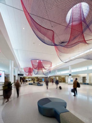
More recently, San Francisco's Terminal 2 (2011) provides a lounge-like mood zone in which to recompose yourself after security (and who wouldn't need to in America). Gauze-like floating sculptures overhead gently ripple in computer-controlled breezes like giant jellyfish.
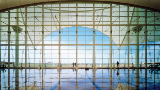
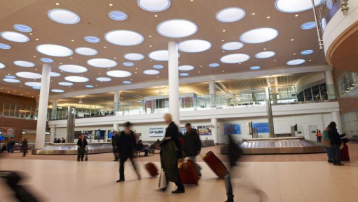
Baggage areas are also generally dreary. The only one I'd care to copy? The baggage-claim at Richardson International Airport in Winnipeg (2011) by influential Argentine architect Cesar Pelli. It has 55 round skylights, great during the day, even more beautiful at night, when they're ringed in blue light, as if you're gazing at a galaxy of peculiar stars. The whole airport, actually, is rather wonderful. It's entirely see-through from check-in to gate: not only can you see the planes as soon as you step inside, but you can gaze right beyond to the Canadian prairies.
All of this needs a suitable wrapping, and for the exterior of my airport I'd have to head to Denver, where the Jeppesen Terminal (1995) is sheer brilliance. Hard to believe it's nearly 20 years old, because it has yet to be improved upon. United States-based Fentress Architects created a series of pitched roofs that, to some, recall the peaks of the nearby Rocky Mountains, to others the wagons of early settlers or the tepees of native Americans. This echo of history is also superbly modern: the roofs, credit-card thin, are made of fibreglass coated with Teflon, and flood the concourse with translucent light.
Jeppesen Terminal has a pedestrian overpass that connects the terminal with the concourse. It's high enough to pass right over the top of airplanes that taxi beneath, allowing a close-up view of these mighty machines from a novel angle. Here, architecture meets aeronautics and provides what airports ought to: a moment to make you pause, and feel the glamour and mystique of flying once more.
FIVE MORE AIRPORT DESIGN TRENDS
1. CULTURAL CHARACTER:
Airport architecture is increasingly a statement of location, reflecting surrounding landscapes or building styles. Mumbai's new T2 (2014) is reminiscent of a lattice-screened, light-dappled palace, and hosts significant displays of Indian art.
2. DISTINCTIVE ROOFING:
Unusual roofs are becoming de rigeur. Amman's international terminal (2013) has a multi-domed roof inspired by Bedouin tents, while the wavy roof of Doha's Hamad International Airport (2014) imitates surrounding sand dunes.
3. DIGITAL TECHNOLOGY:
More screens, interactive devices and motion-activated lighting. Bradley West Terminal at LAX (2013) features huge digital screens that interact with passenger's mobile phones, while LED panels show video art and California landscapes.
4. URBAN LAYOUTS:
The same design theories that orient people in towns is arriving at airports. Expect boulevards, open civic plazas, recognisable landmarks and museum areas. Dubai World Central Airport (2010) even has an integrated residential and commercial complex.
5. PLAYFUL BUSINESS SPACES:
Whimsy is entering business-class lounges in both content (putting greens, sports bars) and design. The new Turkish Airlines lounge in Istanbul (2013) features a tea garden, cinema and library; its rounded architecture resembles a hobbit's house.