How to create an award-winning photo portfolio
Can you compile an eye-catching photo portfolio? Our expert resident photographer and Wanderlust Travel Photograph of the Year judge shows you how
Ever since the Wanderlust Travel Photograph of the Year competition opened a Portfolio category, the judges have been arguing about what you have to do to win: notably submitting five images that work together, but avoid repetition.
The 2013 competition's winning entry by Renny Whitehead seems to ignore this, but only when you look closer do you realise that these pictures are a testament to individual difference in a uniform world – here, he explains the stories behind the shots.
The first stage in putting together a portfolio is to come up with a theme. When you have this, make a list of vital bullet points about it, and then take an image to illustrate each of these. Use all of your skills and a variety of techniques. Vary your viewpoint, subject distance and even lens choice to make your pictures visually different.
Many portfolios fall down with the editing. Most photographers form an attachment to certain pictures, with one weak picture often letting down the entire portfolio. Learn to be dispassionate: only include one picture per bullet point, and avoid visual duplication. Finally replace any image that is weak – no matter how much you like it personally.
Steve's advice in pictures
Featuring 2013 Runner Up portfolio by Tom McShane

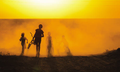
1. Out of the dust
Tom McShane’s runner-up entry is illustrative of the techniques you need to create a portfolio, despite setting himself a hard theme: the social and environmental effect of the shrinking of the Aral Sea in Uzbekistan. The human element of the environmental disaster is shown by the backlit shot of the children walking through the dust. I love the atmosphere of this image, and even though the children are anonymous, their characters shine through in their postures.

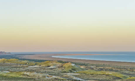
2. Shore leave
The main establishing shot looking over the whole lake illustrates the difficulty of showing something that isn't there. Consequently, it’s the weakest shot of the five, though the blank uniformity of the sky does emphasise the emptiness of the landscape.

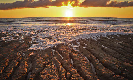
3. Into the sunset
This picture of the salt deposits on the shoreline illustrates a particular feature of the landscape. Shooting at sunset doesn’t just produce a visually contrasting image, but carries a sub-text of the end of the lake.

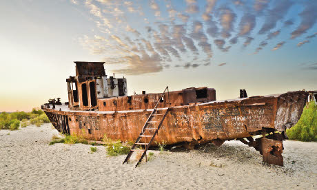
4. End of an era
The receding of the sea and the end of the fishing industry is beautifully characterised by this shot of a rusting boat. The Cyrillic graffiti gives a great sense of place although compositionally I would have liked to see little more of the cloud formation and a little less beach.

5. Fish stew
This final image is easy to undervalue at first. To me it is reminiscent of images of dried fish in Asian and African markets, although these look unappetising and discarded, while the desiccation of the environment is emphasised by the crack in the ground. As an extreme close-up this image also gives some visual contrast to the whole portfolio.
To display your photo portfolio to full effect, check out Bob Books' photo books, wall art and calendars – available via the Bob Books website and app. Wanderlust readers get 10% off every order – see our Hot Offers for details.
Steve leads a range of travel photography tours – see Better Travel Photography for more information.

