With the 2013 Wanderlust Travel Photograph of the Year Competition still open for entries, judge Steve Davey offers his insider tips on the Travel Icon category, and what makes a winning photo
The most eclectic category of the Wanderlust Travel Photograph of the Year competition is Travel Icon – both due to the variety of the subject matter submitted and the creativity of the entries. And yet, many still seem unsure of what constitutes an icon, so here are a few hints to heed before you enter this year.
You need a really clear idea of what makes an icon. Believe me, the judging panel has argued a lot over this, but in my opinion an iconic shot is one that sums up an instantly recognisable characteristic of a destination. You might find a tourist cycle-rickshaw in Covent Garden, but this is no more iconic of London than the ‘performers’ who paint themselves silver and stand still on the Southbank. A cycle-rickshaw is iconic of India; a human statue might only be iconic if they’re wearing a Venetian mask and standing in the Piazza San Marco.
Certain sites are iconic: think of those incredible places that just shout the name of a country. Angkor Wat screams Cambodia; Machu Picchu yells Peru; the Pyramids holler Egypt.
An iconic subject is not enough, though. We want a unique and creative image of your iconic place – something we haven’t seen before. By definition, an icon should be instantly recognisable and therefore familiar; however, we want to see images that are unfamiliar!
Unfamiliar images of the familiar can be achieved in many ways. The simplest is to photograph in more atmospheric light – this usually means sunrise or just before sunset. It also calls for perseverance: you might have to spend time there or revisit a place to get it right.
You should also look for alternative angles and experiment with different techniques to produce striking results. This might include exploiting depth of field, composition or how the camera renders movement.
These four shots have all been shortlisted in past Icon categories – here’s why I think they made the grade.
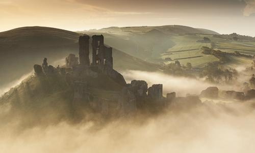
 1. Corfe Castle at sunset Dorset, UK
Photographer: Bart Heirweg
This is undoubtedly an iconic sight, but the photographer has done far more than simply snap a shot. He’s taken this at sunset, when swirling clouds wreath the ruins. He’s also shot from a neighbouring hill, so the surrounding landscape forms the backdrop; if he’d shot from lower down, the sky would have formed the background, giving much less sense of place.
There’s always a degree of luck involved. If the light hadn’t been so atmospheric, the picture might not have won. But good luck usually results from persistence – I’d be surprised if this was Bart’s first visit to Corfe Castle.
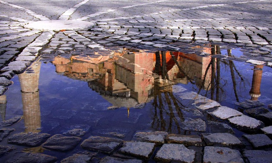
 2. Reflection of the Hagia Sofia, Istanbul, Turkey
Photographer: Nori Jemil
You won’t always be lucky with the light or the weather, as this iconic shot shows. The winner of the 2010 competition, this illustrates how you can take a unique picture, even when conditions are against you.
Shooting the mosque as a reflection in a puddle has helped to justify and conceal the poor conditions. The composition of the cobbles, and the placement of the reflection are perfect. It’s a picture that can be looked at for ages, and it really gives a feel for what it was like to be there.
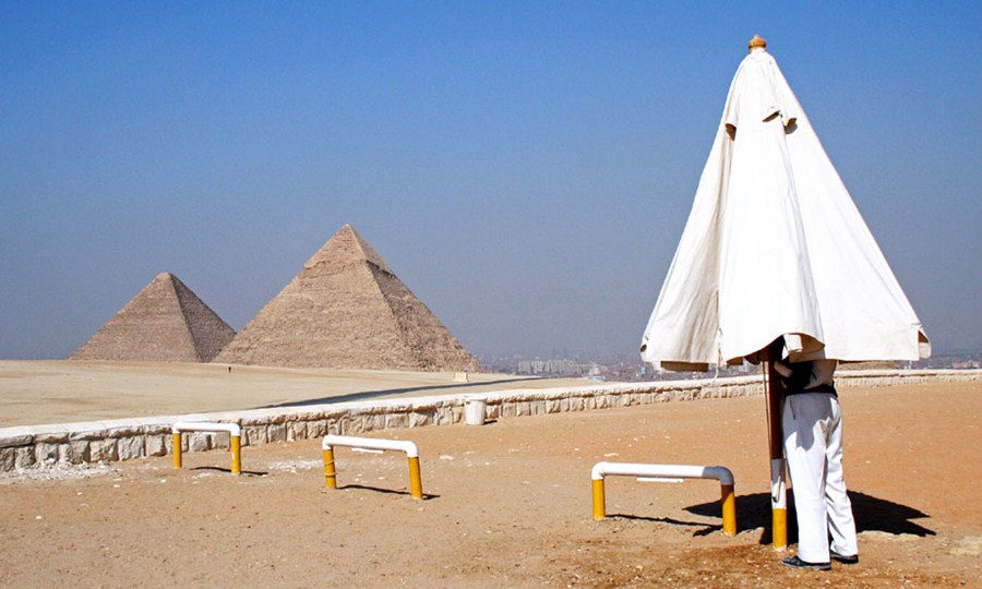
 3. Parasol trouble, Giza, Egypt
Photographer: Adam Akins
Humour is often misplaced in photos – visual gags can be trite and forgettable. This shot of a guard struggling with a parasol at the Pyramids has a level of humour, but a remarkably sophisticated composition makes it stand out.
First, the Pyramids and the parasol line up, as if part of the same monument – an impression enhanced by the fact that only two of the three Pyramids are visible.
The anonymity of the guard also throws up questions: who is he and what is he doing? This prompts us to look at the image a little longer. It’s an observed moment captured at a truly familiar spot – exactly what we’re seeking.
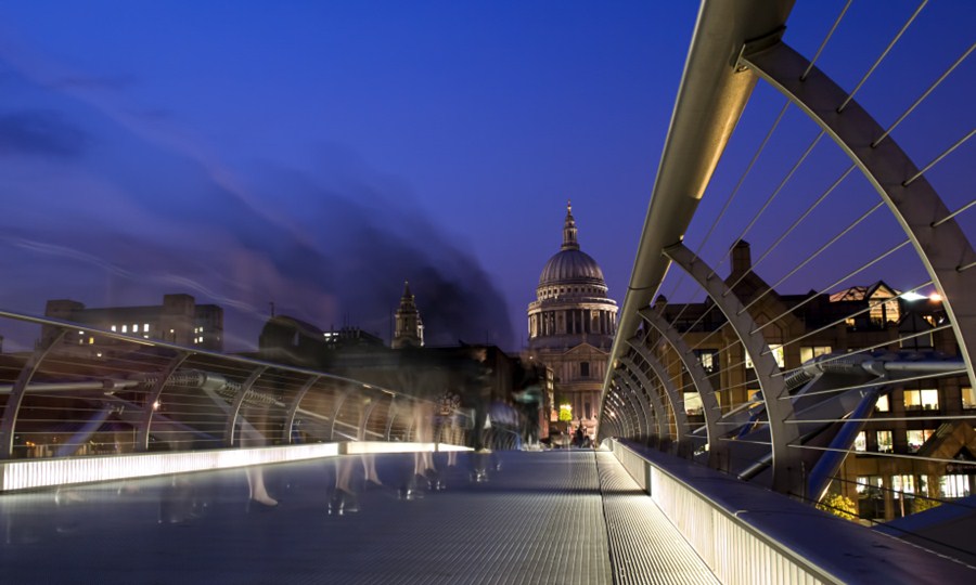
 4. Millennium Bridge Walk, London, England
Photographer: Marius Gheorghe Musan
This shot captures the instantly familiar St Paul’s Cathedral from a unique angle. It’s shot at the perfect time for night photography, when there is still some light in the sky, and with excellent technical skills. The contrast between the stability and focus of the cathedral and the blur of the moving people works well; there’s visual intrigue too – who are these anonymous souls? The image works on a number of levels.